
Resource Guru reviews: What verified customers have to say
Explore Resource Guru reviews from teams using it to plan reliably, schedule with clarity, and deliver projects with confidence.
Written by Maria Keenan
Reach peak productivity and team harmony with practical guidance on resource and project management.
Explore Resource Guru reviews from teams using it to plan reliably, schedule with clarity, and deliver projects with confidence.
Written by Maria Keenan
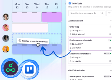

Turn Trello cards into Resource Guru bookings so you can build team schedules that reflect who’s really available.
Written by Maria Keenan


Compare the 11 best capacity planning tools of 2026 by features, pricing, trade-offs, and best use case.
Written by Dan Collins


Connect ClickUp to Resource Guru for a clearer way to schedule tasks around real availability and capacity.
Written by Maria Keenan


Explore how our new one-way sync with monday.com turns your team’s task list into achievable, sensibly scheduled workloads.
Written by Maria Keenan


Agency capacity planning is the key to happier teams and increased profitability. Read our guide full of capacity planning strategies, steps, and best practices.
Written by Dan Collins
Expert input from
Rob Sayles

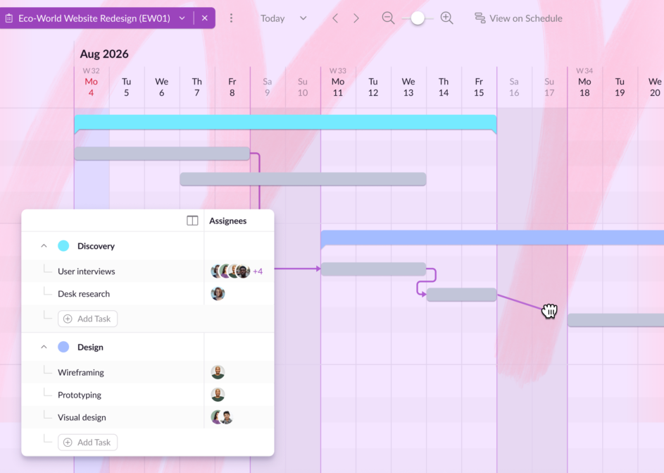
Explore how the addition of Gantt charts to Resource Guru aligns planning and scheduling for smoother project delivery.
Written by Maria Keenan


See how the NSPCC’s creative team saves 30 hours a week by using Resource Guru as their team scheduling software of choice.
Written by Maria Keenan
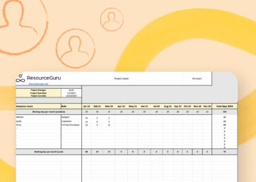

Download your free resource capacity planning template for Excel and Google Sheets today to understand how much work your team can take on.
Written by Dan Collins


Resource management has a direct impact on revenue. That’s why you want to make sure that your resource management software can help you maintain a healthy bottom line (and happy employees). Two of the most established…
Written by Jo Johansson


Explore the benefits of Resource Guru’s SOC 2 Type II compliance including what it means for your security and privacy.
Written by Maria Keenan


Learn how to forecast demand, spot capacity gaps, and build a resource capacity plan that keeps projects on track.
Written by Dan Collins
Input from experts including
Jon Morgan


Choose public holidays by country or region to save time and get a complete view of availability for accurate scheduling.
Written by Maria Keenan


See how Phases boosted on-time software development project delivery by 25% using Resource Guru.
Written by Maria Keenan


If your organization is struggling to keep projects on track with spreadsheets, emails, and files that seem to vanish right when you need them—you’ll be pleased to know that there’s a huge variety of project scheduling…
Written by Stuart McLachlan