When you’re looking into how your projects, team, and business are performing, the real goal is insight—and getting there without digging through a mountain of data.
That’s why we just rolled out six pre-built reports with key stats, customizable tables, and dynamic charts that make the numbers easy to grasp at a glance. Let’s check them out.
In this article 📖
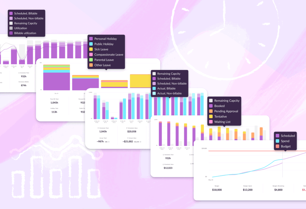
Analyze utilization and capacity
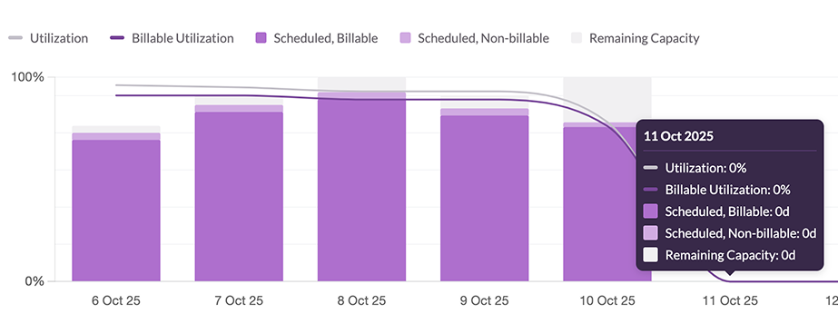
The utilization and capacity report breaks down exactly that: remaining capacity, billable scheduled work, non-billable scheduled work, utilization, and billable utilization.
This report helps in a few ways:
In terms of planning for the future, you can easily understand upcoming capacity. If there’s more demand than capacity coming up, you’ll know to bring in extra FTEs or freelancers to cover the workload.
On the flip side, if you’ve got more capacity than upcoming work, you know you’ll need to pitch for new projects.
You can also use this report to dig into historical utilization to evaluate where billable time was lost or went unoptimized. Using that knowledge, you can avoid the same pitfalls during future projects.
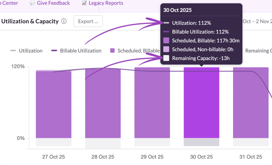
Plus, it’s helpful if you’re weighing capacity against demand. Utilization can rise above 100%, indicating that the existing team has too much work on their plate. Similarly, remaining capacity can dip into negative numbers, indicating the same. Both indicators tell you when you need to recruit more folks to help carry the load, and when to do so.
Dig into bookings by type
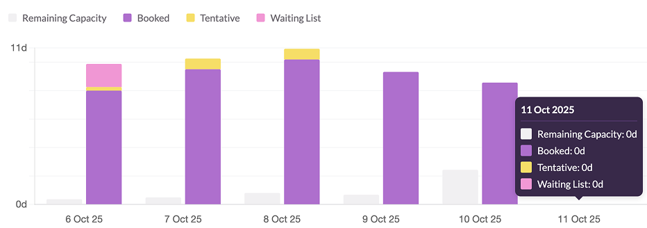
This is another report that helps you look to the future. Specifically, this one lets you identify the volume of tentative work, work on the Waiting List, or work pending approval, that’s lined up.
Armed with that information, you can chase down each unconfirmed initiative and close as much business as possible. This helps you protect your utilization metrics, and your margins.
On the flip side, if all that unconfirmed work unexpectedly lands at once, you might end up with a tonne of work you haven’t got capacity for. This report solves for that by helping you plan for different scenarios where various amounts of that work gets confirmed.
Either way, this report helps you stay one step ahead, making sure you have enough capacity to keep up with demand, and enough confirmed work for a healthy bottom line.
Compare scheduled and actuals
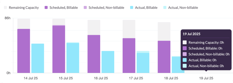
This report compares work that’s scheduled against actual work completed—both billable and non-billable.
Essentially, it’s an easy way to understand if you’re burning project hours above or below the expected rate.
Overall, it tells you how accurate your forecast was, and if work took more or less time to complete than you thought. You can use that information going forward to refine future forecasts for better accuracy. The end result? Better tactics for hitting your billable utilization goals, and a healthier business bottom line.
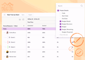
Get an overview of all your projects
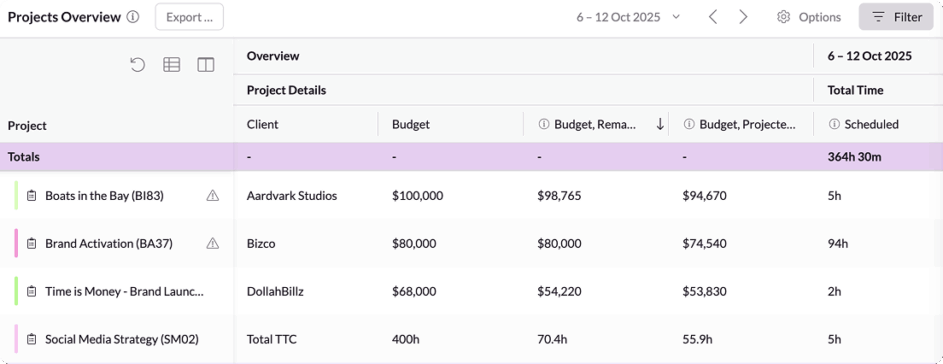
This report includes a handy table of all your projects alongside key details, a breakdown of total and billable time, and financial info.
Use it to skim through all the initiatives you’ve got in the works, find which are out-performing and which are under-performing, and make adjustments accordingly. If you want to dig into any project in more detail, just use the next report on the list.
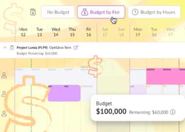
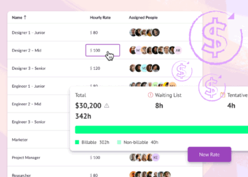
Go deep into individual projects
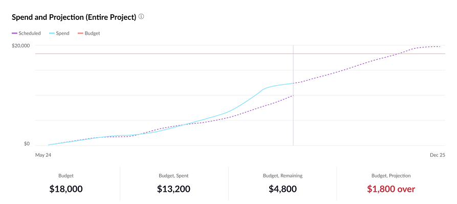
This one’s a biggie. Being able to monitor and forecast spend on projects is business-critical. This report makes that easy to understand in seconds.
On Resource Guru, you can assign hourly rates per person, or role. You can also edit a person’s rate by project. Similarly, you can assign a budget to each project—either by fee or by hours.
Based on that data, combined with time scheduled and actual time logged, this report highlights how each project is tracking against its assigned budget.
That way, you can see how budget burn will progress over time. Using this, you’ll know ahead of time when you have to make adjustments. In short, this report is key to protecting project—and overall business—profitability.
Explore different types of time off
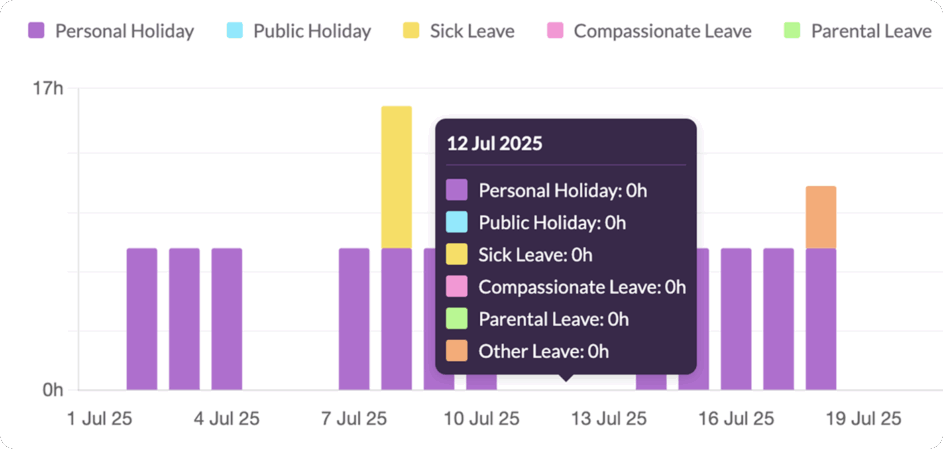
After going through the other reports, you’ll quickly understand that your team deserves a break every now and then. And you can analyze that side of things too, with the time off report.
It lets you spot seasonal trends where people are more or less likely to have their OOO on. When a lot of folks are taking vacation, for example, you might need to think about outsourcing if you don’t have enough people available for the projects you’ve planned.
Make these reports work even harder for you
These new reports are live in all accounts with access to the suite, and come out of the box, so you can start using them right away. That said, there’s plenty more to discover—including super flexible ways to customize these reports for all your in-depth analytics needs.
Reports are available on Blackbelt and Master plans. Learn more about their full capabilities in our Help Center.
What’s next for Resource Guru?
Check out our product portal for the latest updates on our roadmap, including multiple out-of-the-box integrations.
Explore our product portal to see what’s planned next and what we’ve already added. Vote on which features are most important to you and submit new ideas to have your say!What’s next for Resource Guru?