Here at Resource Guru, we’re in the process of modernizing our entire application. It started with our nerve center, the Schedule. Now, we’ve just released a brand new design for Projects and Clients with some huge improvements. Let’s dive into what’s new …
A unified view
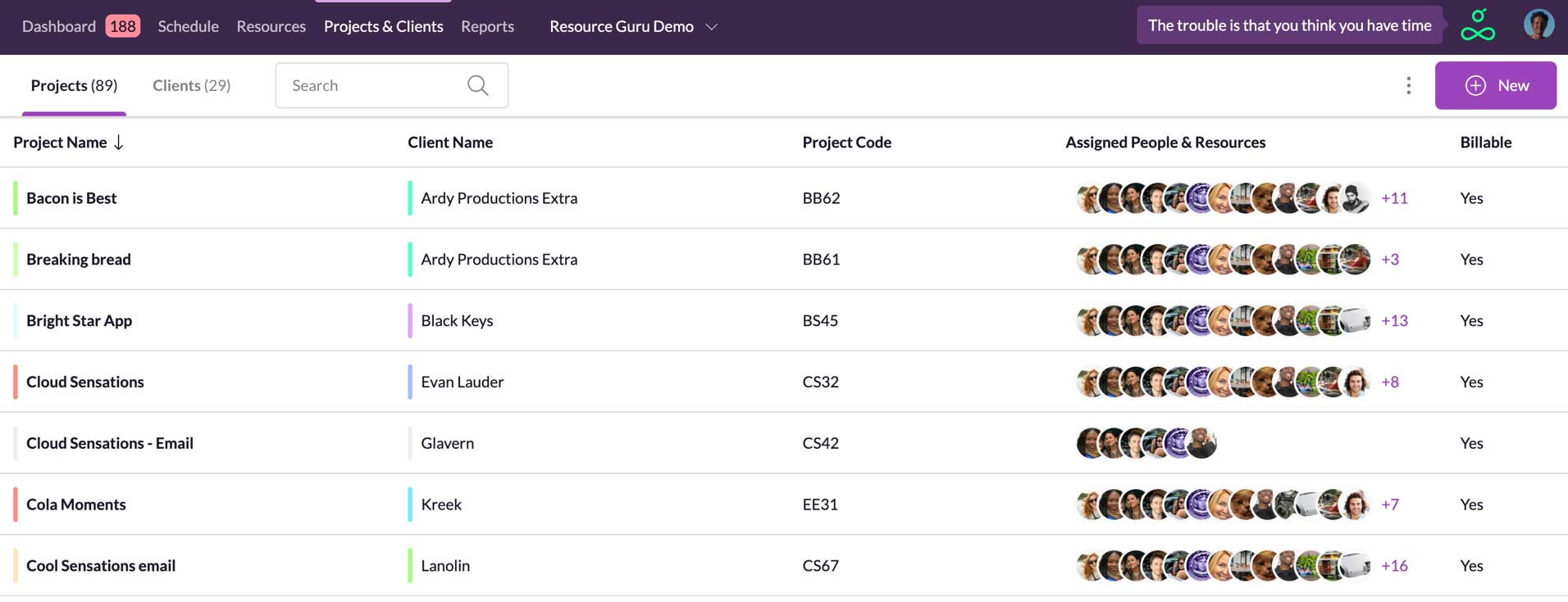
The first thing you’ll notice is that we’ve merged Projects & Clients into a single section. This made sense because projects and clients are so closely related. And you often want to see all the projects belonging to a single client. Everything is now in one place making it much snappier to switch from one to the other.
A fast-loading, sortable table layout
We’ve now switched to a table layout which has a number of advantages. Firstly, you can sort by column which means if you want to see your projects grouped by client, for example, you can. Secondly, it provides an easy way to scan the data and compare specific attributes like whether a project is billable or not. This will become more and more important as the app evolves.
Another benefit of the new design is that it functions like a single-page application (SPA). In other words, load times are non-existent when moving between any page using the new codebase.
We’ve tested this new design with tens of thousands of projects and it’s super quick and scalable.
Find it quickly with search
We’ve added a search at the top so you can quickly focus on projects or clients you’re interested in. Search by project/client name or project code and get instant results. Filtering options will follow in the future too.
Mobile friendly
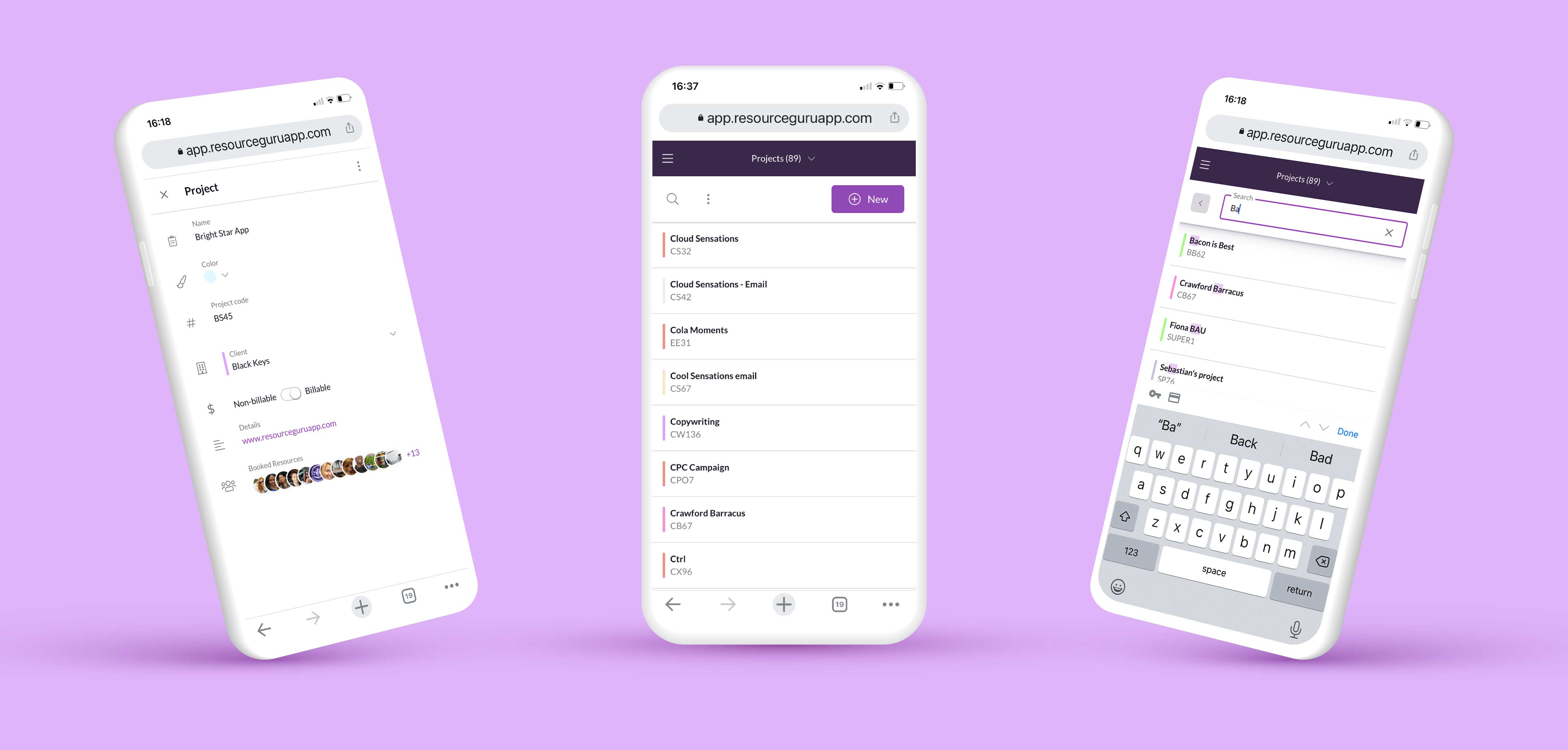
We know how important mobile access is to many of you so you’ll notice that any new section we develop like this one works seamlessly across any device – just like the existing Schedule does.
Assigned resources
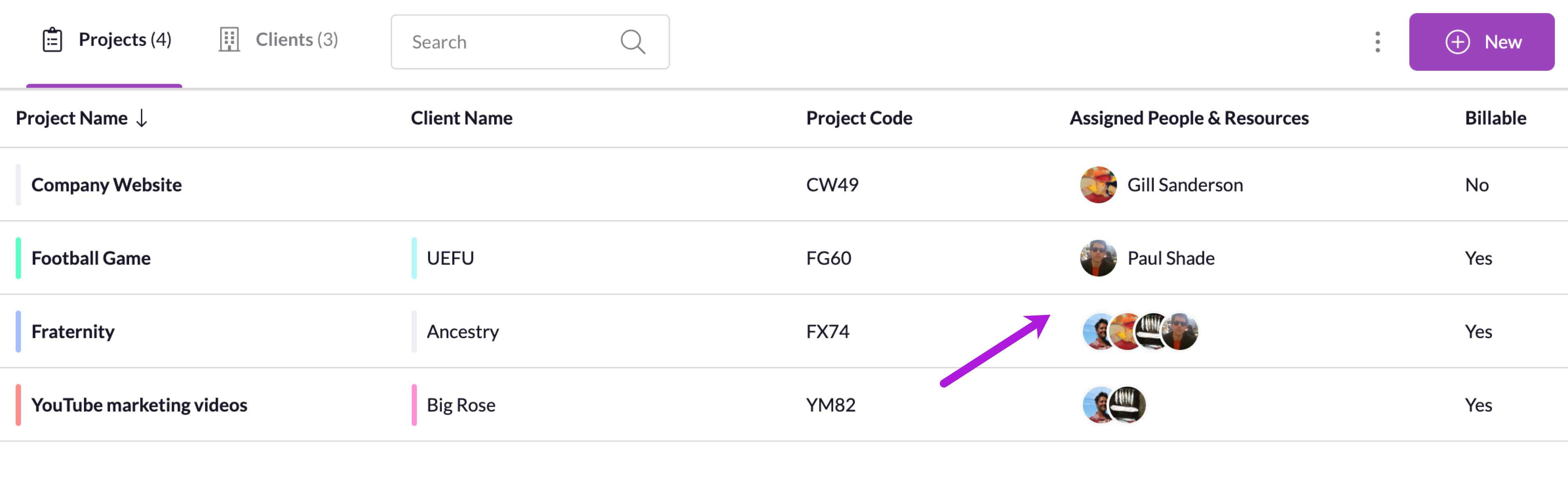
Assigned resources were visible on the old project cards too, but you can now see them at the top level where they are easy to scan.
Injecting joy
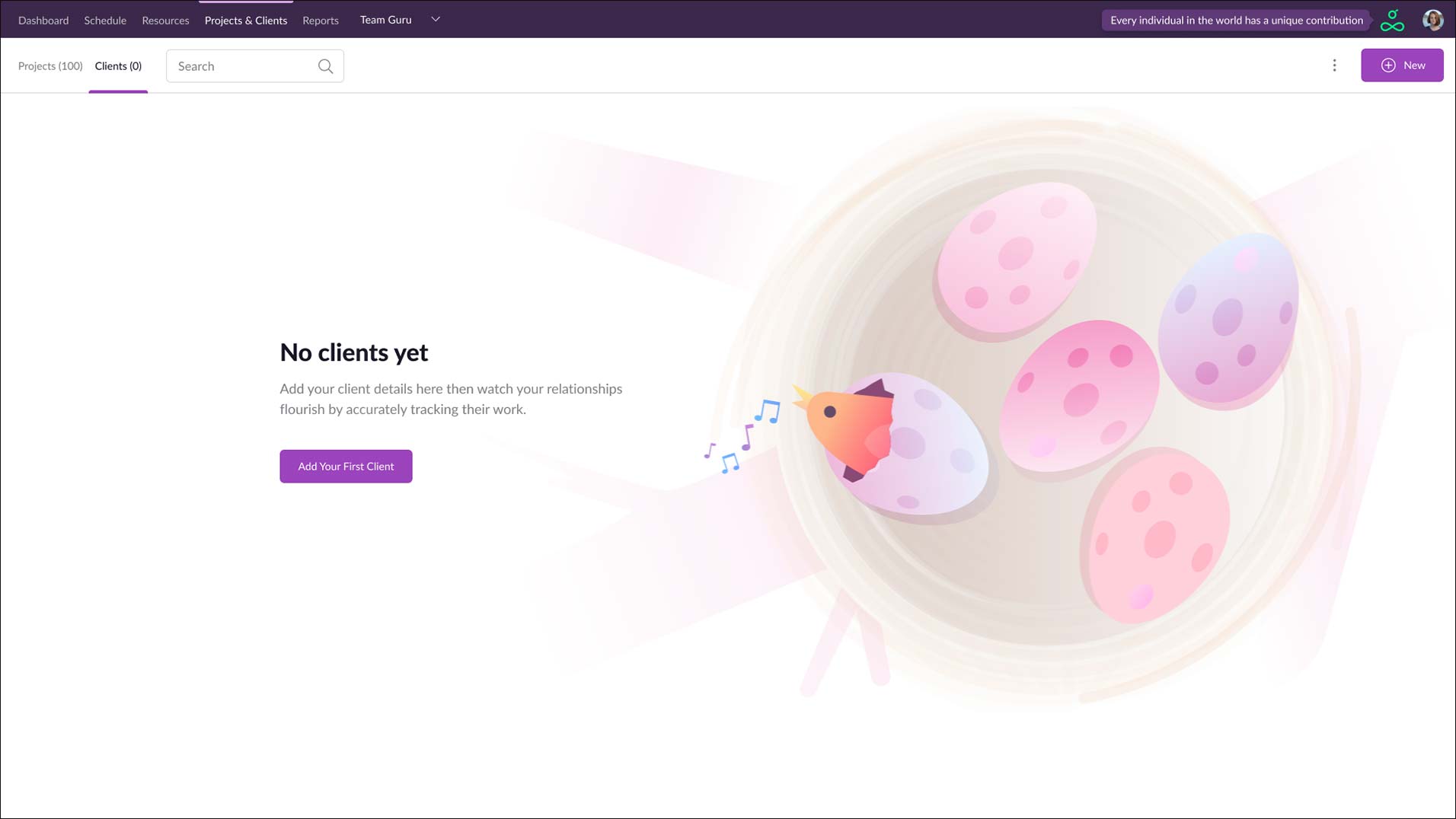
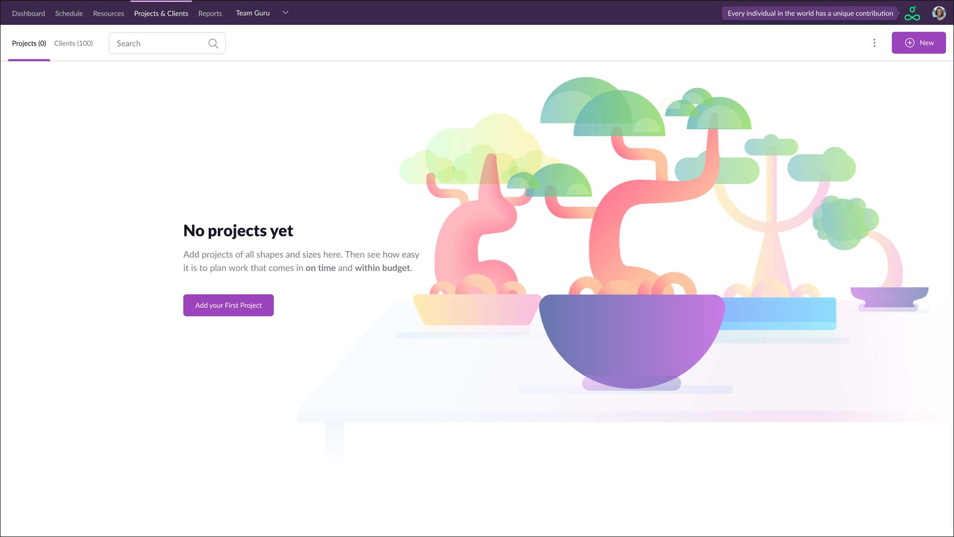
In the past, new customers were greeted with rather unwelcoming blank pages. This did not deliver the kind of joy we want for our customers so, as we modernize the app, new life will be breathed into it with branded illustrations and helpful wording. If you’ve been with us for a while, you’re unlikely to see these, so we’ve added a couple of examples above :)
We hope you like these improvements and our design direction. There will be many more enhancements to come as we modernize the rest of the app. Please get in touch if you have any feedback.