It’s been 8 years since we launched Resource Guru. Over that period, we’ve been on an amazing journey and acquired some incredible customers. While our company has evolved and grown, our brand essence hasn’t changed much. We remain passionate about making work as enjoyable as possible for everyone.
However, the time had come for our old guru to retire and tend to his vines. We merged minds with Co&Co and Paraform to explore how we might modernize our brand and better represent its personality. Let me present our zingy new identity and website.
Brand
Our brand vision has always essentially been about valuing productivity, simplicity, happiness and success. And, over the years, we’ve come to realise that TIME is the single most valuable commodity in life. Our aim is to be a magical and insightful guru. Helping teams do their best work in a happier, healthier way. Ultimately we want to give teams superpowers so they can harness their resources, master their time and succeed.
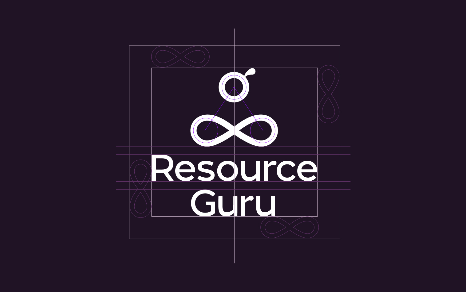
New logo
Our guru was tired and ready for retirement so we replaced him with this dude. We wanted something iconic. The new mark is designed around symmetry and balance. Helping people achieve a work life balance is another important goal of ours as you can see from the new title of this blog :) It also incorporates the infinity symbol which is a slightly oblique reference to the nature of time. The guru will live forever, but our time here is short, so let’s not waste it!

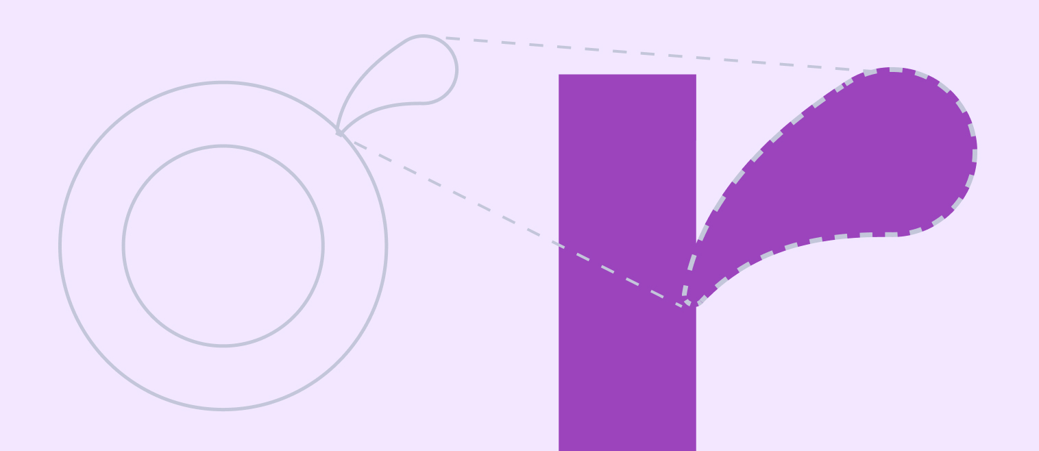
The crossed legs are formed from an infinity symbol, connecting the bottom circles, which represent the infinite nature of time. The head is built around the third circle at the top and as a final flourish, to symbolise the characterful nature of Resource Guru, a top knot is taken from the terminal of the letter r in the wordmark.
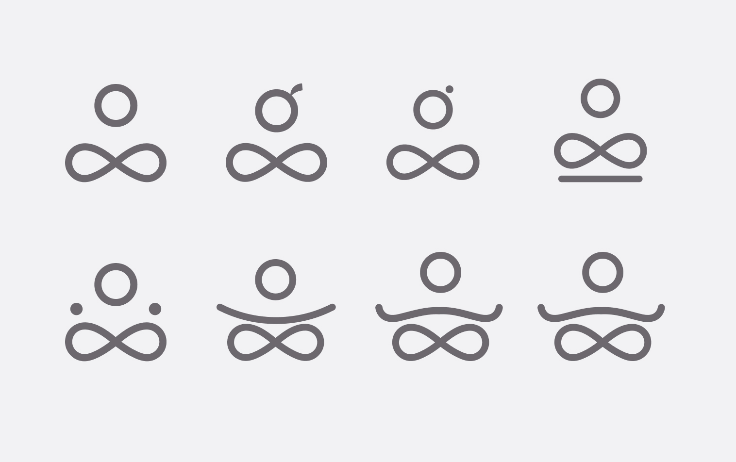
Here are some that didn’t make it!
Typography and colours
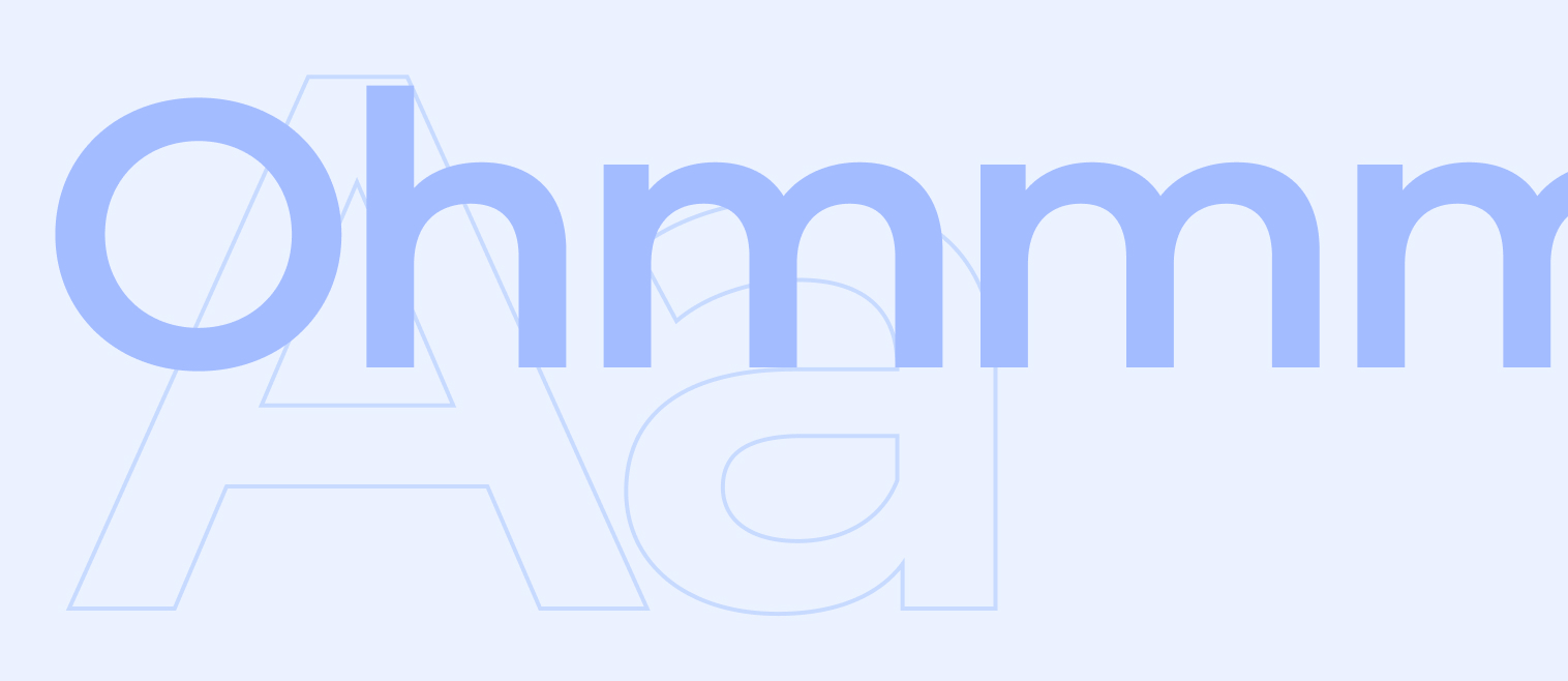
We’re using two new fonts. Montserrat’s geometric nature compliments the harmony and balance of the logo and makes for easy reading on our website and blog.
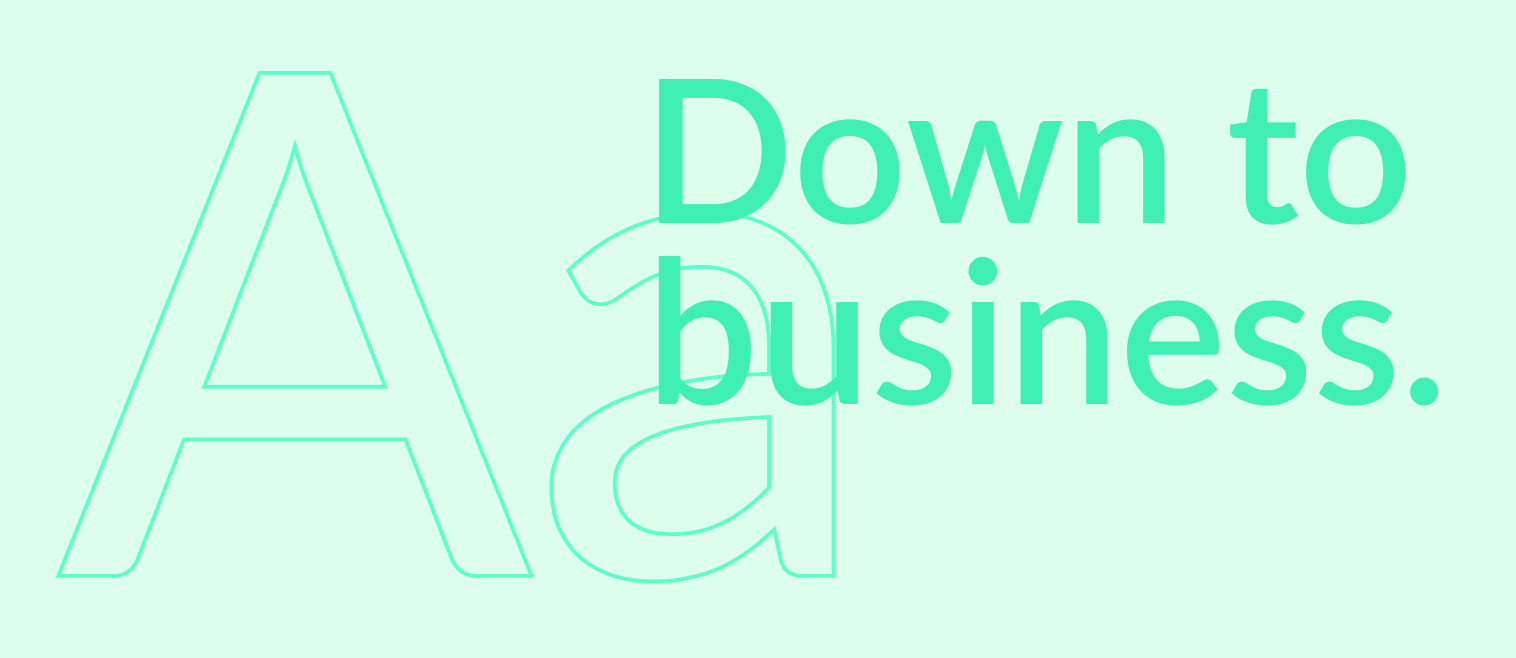
While Lato, a more functional font, is great for the app as it’s nice and clean and remains legible at small sizes.
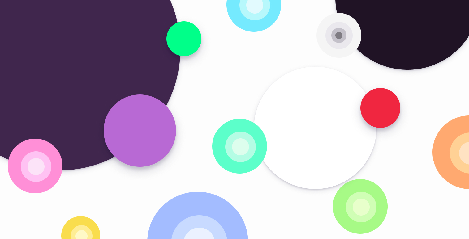
We have a whole new colour palette …
… and an atomic design system to match.
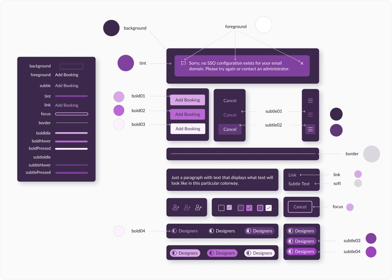
Over the coming months we’ll be deploying this system throughout the app which will lead to increased consistency and more rapid development cycles.
Illustrations
We wanted bright colourful illustrations that are mystical, quirky and fantastical and make you smile. So we went in search of the next Eyvind Earle, and found him in the form of Febin Raj!
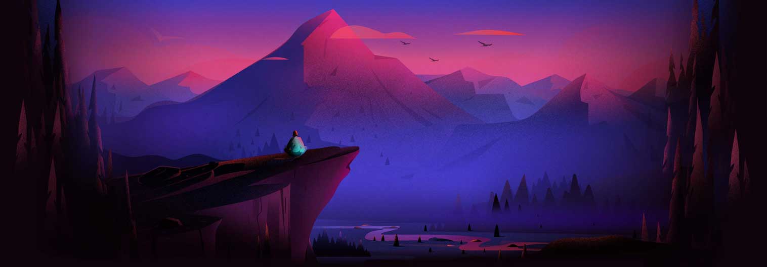
How much do you want to be here? 😍

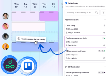
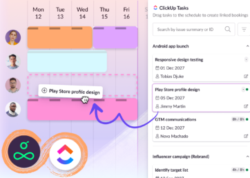
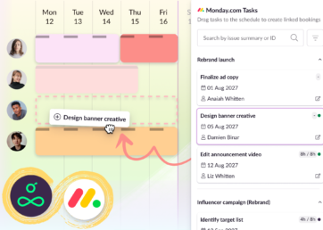
Streamers
The coloured streamers we use are a loose reference to Resource Guru’s schedule and colourful bookings. Often converging to a single source of light, they express another of our brand’s cornerstones, delivering order from chaos.
Website
Pulling all this together into a neat little package just in time for Christmas is our new website; built by our in-house team of craftsmen. Our previous site wasn’t backed by a CMS which meant that changes were slow and frustrating. After reviewing the market, we settled on the combination of a headless CMS called Sanity and the Next.JS framework. One of Sanity’s loading messages is “restoring sanity” and we’re looking forward to it delivering on that promise! Please explore the new site and let us know what you think. Hope you like it!